(CASE STUDY)
Noe Gold
Client
Noe Gold
Year
since 2025
Sector
Investments / Fintech
Services
Platform UX/UI / Progressive web app / Rebrand
Noe Gold is a precious metals company that lets clients own physical gold, stored in vaults in Switzerland and Austria. The gold itself sits in a vault the client will never visit, so most of what they see of it is paper and screen: the contract they sign, the certificate that proves ownership, the statement that tracks it.
The collaboration began with the platform: a complete UX and UI redesign of the system clients and partners live in every day. The brand followed, rebuilt around the same idea: when the product is stored out of sight, trust is decided on screen and on paper before a single gram is bought.
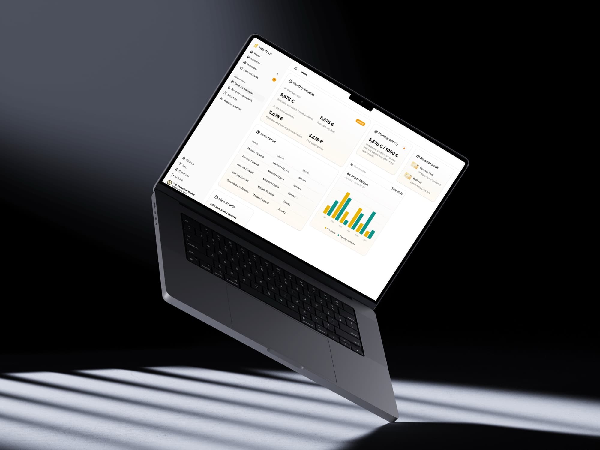
Client
Noe Gold is a precious metals company that lets clients own physical gold, stored in vaults in Switzerland and Austria. Clients buy and sell precious metals, track their holdings, and often bring in new clients through a partner structure.
So the brand is not decoration around the product. It is where a client decides whether to trust the company with their money in the first place, before a single gram is bought.
Challenge
The work began in the summer of 2025 with a complete redesign of the client platform, from both the UX and the UI perspective. What existed were endless tables: functional for administrators, illegible for a client deciding what to do with their money.
Later, the brand followed. It was inconsistent and the website needed a serious update. The identity had to carry the gravity of the commodity and feel at home in a modern digital product at once, and read identically in a contract, on a certificate, in an email and on a client card.
Platform UX & UI
Complete redesign of the client and partner platform: buying and selling precious metals, transactions and portfolio tracking, and onboarding of new clients, on desktop and mobile. Delivered in 12 weekly sprints.
Progressive web app
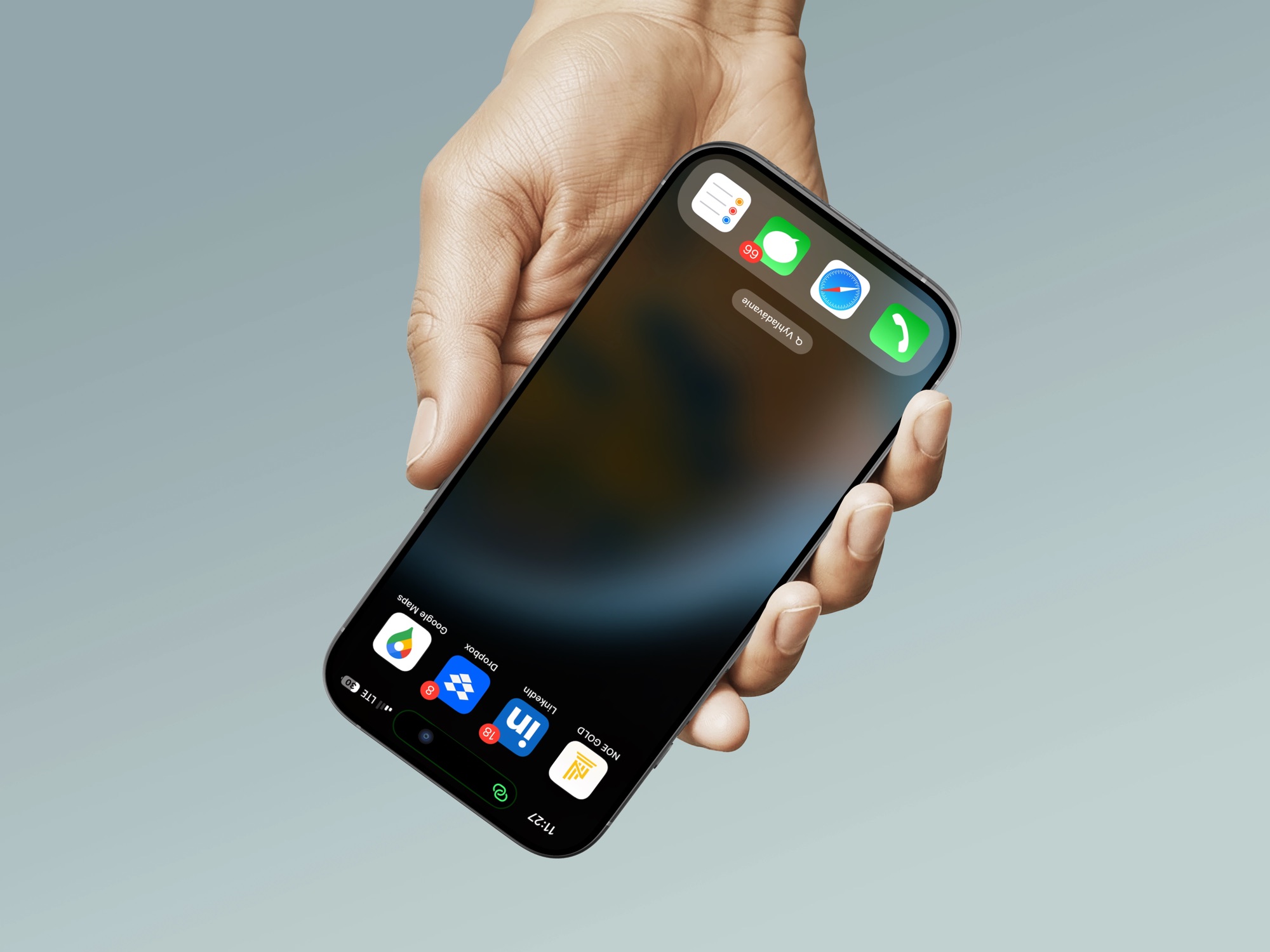
The platform installs from the browser straight to a phone's home screen, which saved the company the cost of developing and maintaining a native app.
Referral system & structure view
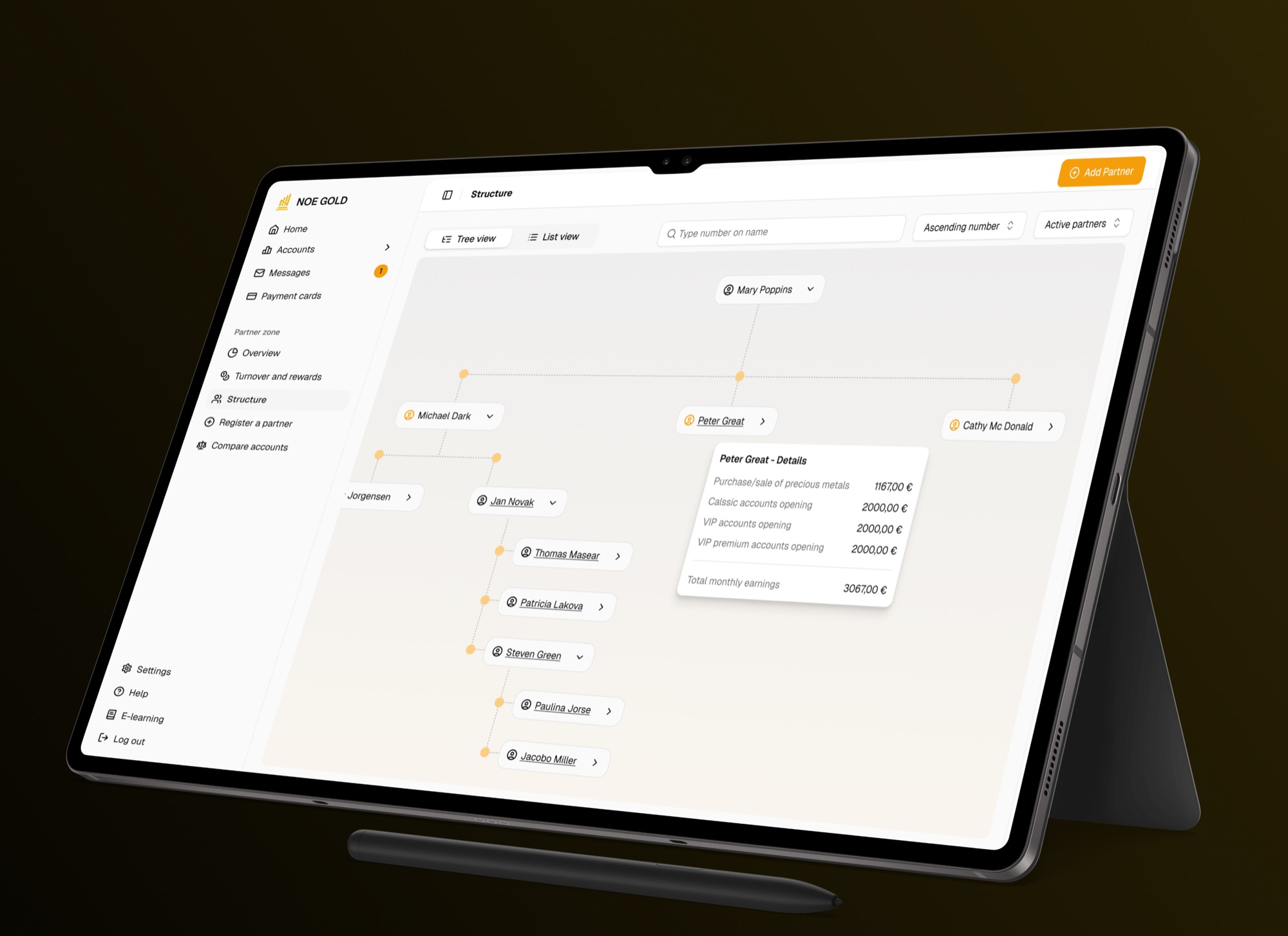
A built-in referral flow for onboarding new clients, and an interactive tree view of the whole partner and client structure.
Brand workshop & guide
A workshop that defined Noe Gold's core values and positioning, translated into a comprehensive brand guide: a light logo refresh, typography, palette and a photography style for partners.
Branded touchpoints
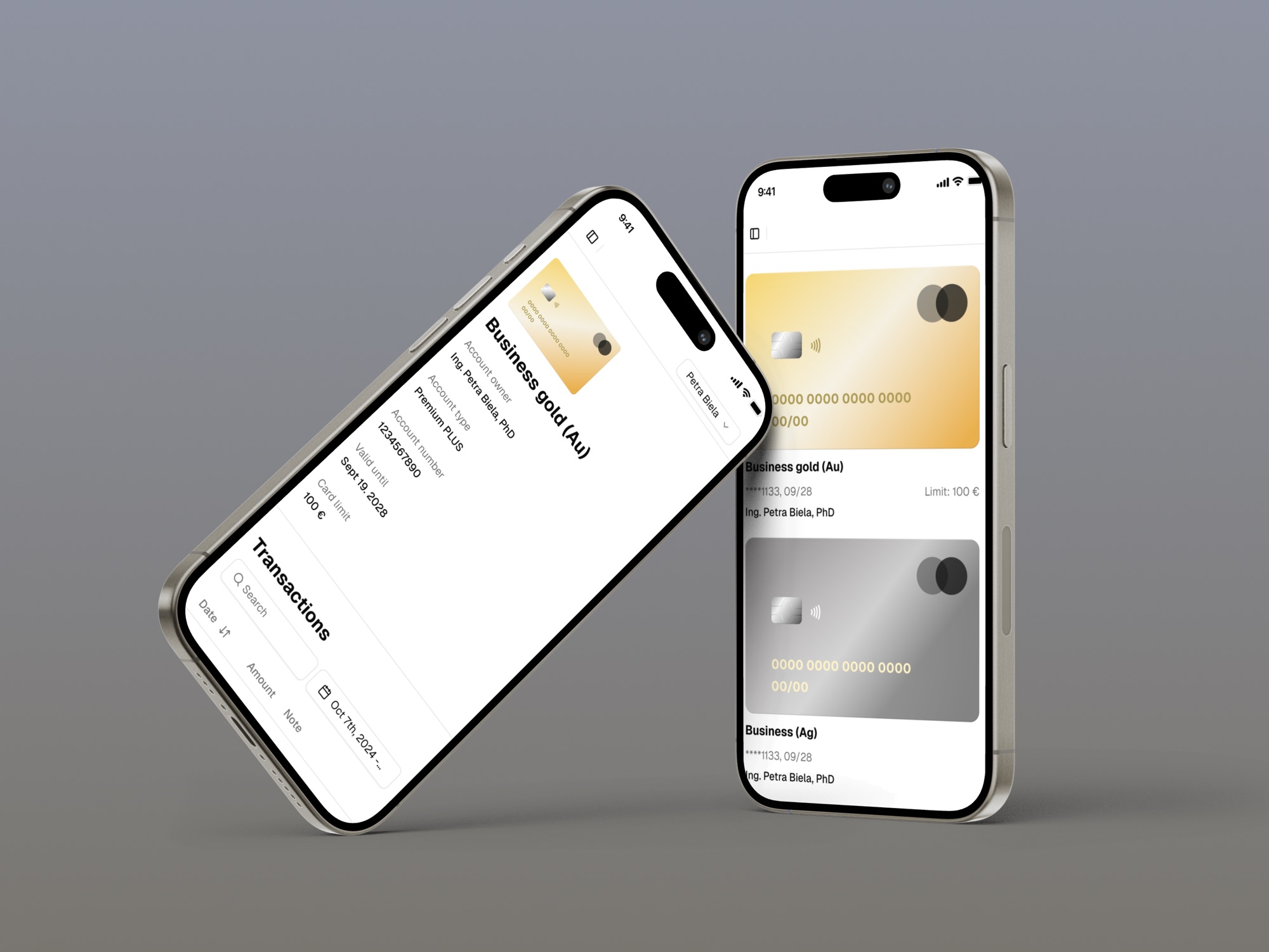
13 dynamic document templates and 14 transactional emails generated from the system, plus presentations, business cards and client cards in gold and silver editions.
noegold.com
A new public face for the brand.
TABLES BECOME FLOWS
The old platform was administration: tables a client had to decode. We rebuilt it as flows, so buying gold, selling it, or reading a statement is a path with one obvious next step. It is now easier than ever for clients to purchase or sell precious metals, track their holdings, and onboard new clients.
A WEB APP THAT INSTALLS LIKE A NATIVE ONE
Built as a progressive web app, the platform downloads straight to the phone from the browser. Clients get the native-app feel on mobile; the company skips the cost of building and running a separate native app.
GROWTH BUILT INTO THE PRODUCT
Referrals are a product flow, not a paper form. Onboarding a new client takes minutes, and the interactive tree view shows every partner exactly how their client structure grows and earns.
TRUST DEFINED IN A WORKSHOP, NOT A MOODBOARD
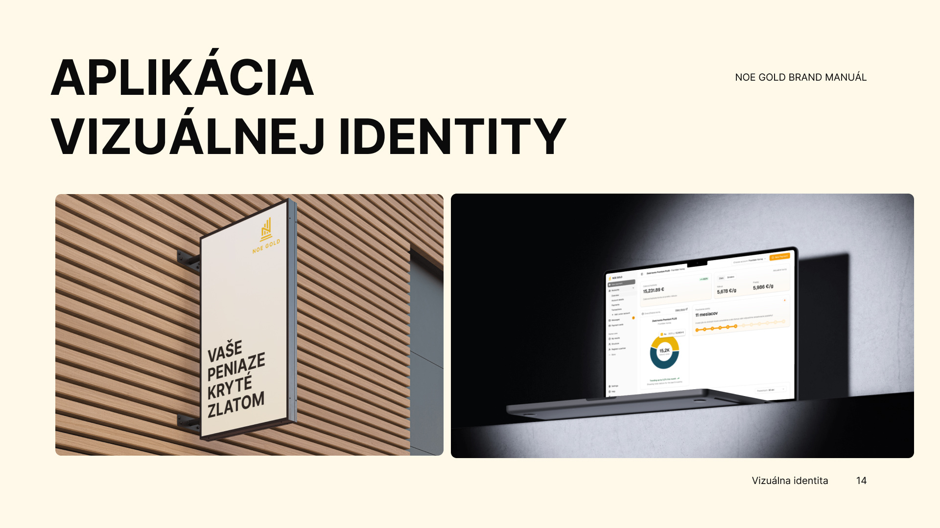
The rebrand started with the client's own words: a workshop defined the core values and positioning, and the brand guide translated them into a system. A light refresh of the logo, a photography style for partners, and rules that every document, email, presentation and business card follows.
More than 600 clients manage their gold on the platform within its first year. What once were endless tables are now flows a first-time buyer can read, on desktop and installed on their phone.
The identity from the workshop carries Noe Gold until today: on the platform, in 13 document templates and 14 transactional emails, in presentations, on business cards and on client cards in gold and silver editions.
The collaboration continues. Version 2 of the platform is in the works, and the backend is moving to a newer, lighter technology.
Your clients trust you with their wealth. The brand has to give them certainty before they sign.
Credits
Anna Lukáčová (design, brand identity), Michal Chrmo (backend, business development), Ammar Almahdy (frontend development).
Links